Elevating Amusement Park Experiences
UX / UI / PRODUCT DESIGN
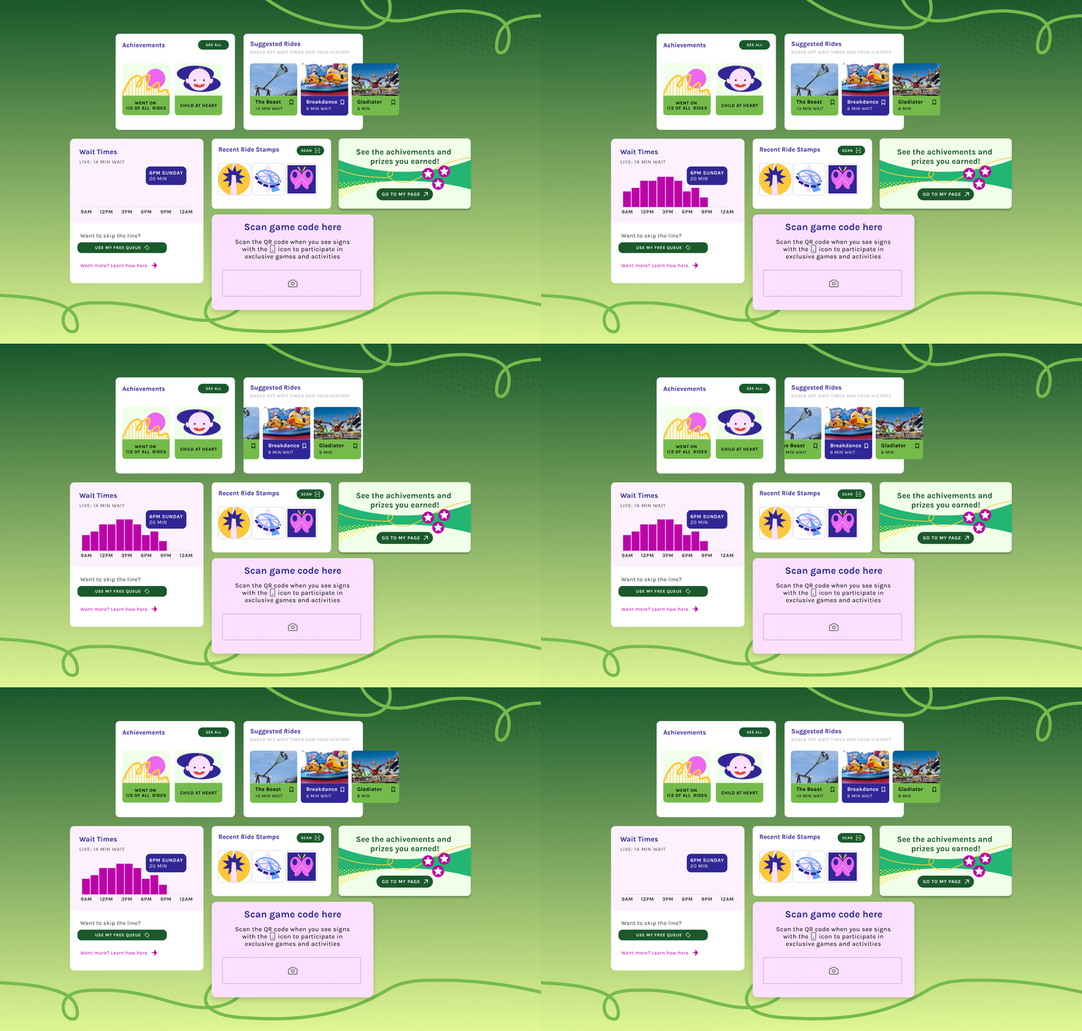
OVERVIEW
How can we ensure our visitors have a well-spent, meaningful, and joyful experience at the amusement park, where every moment feels worthwhile?
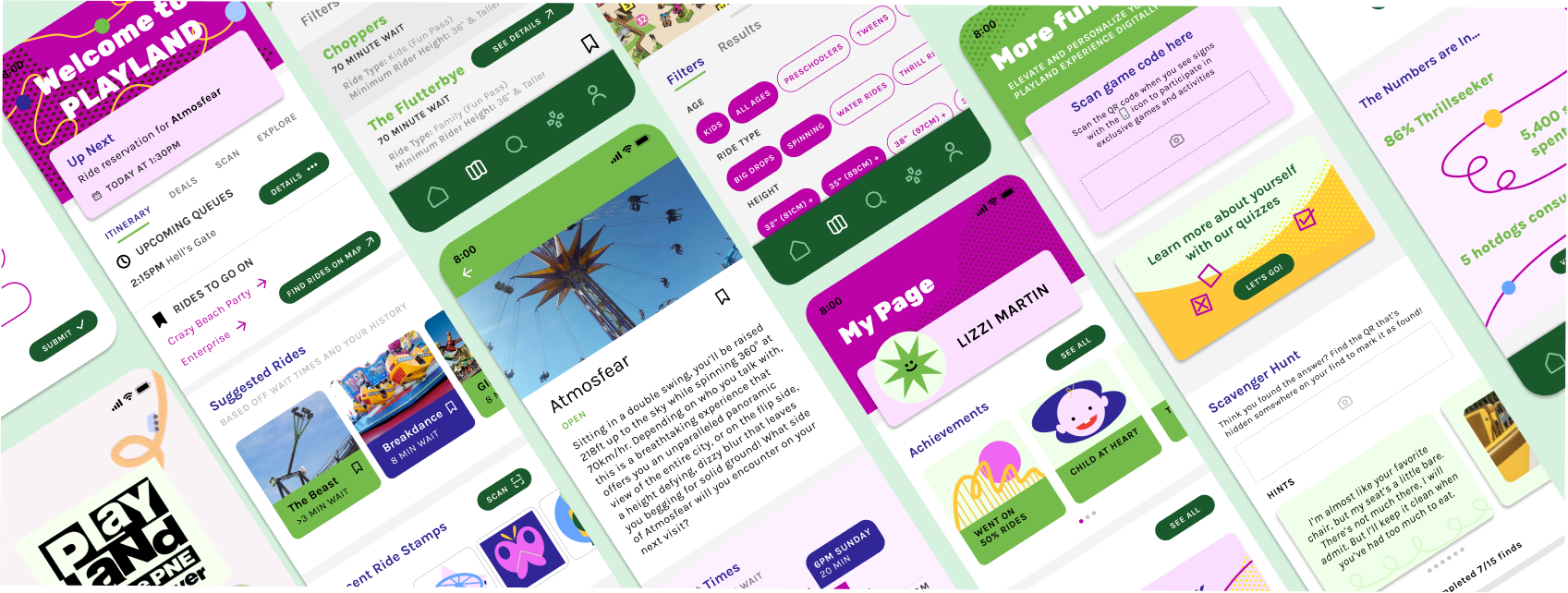
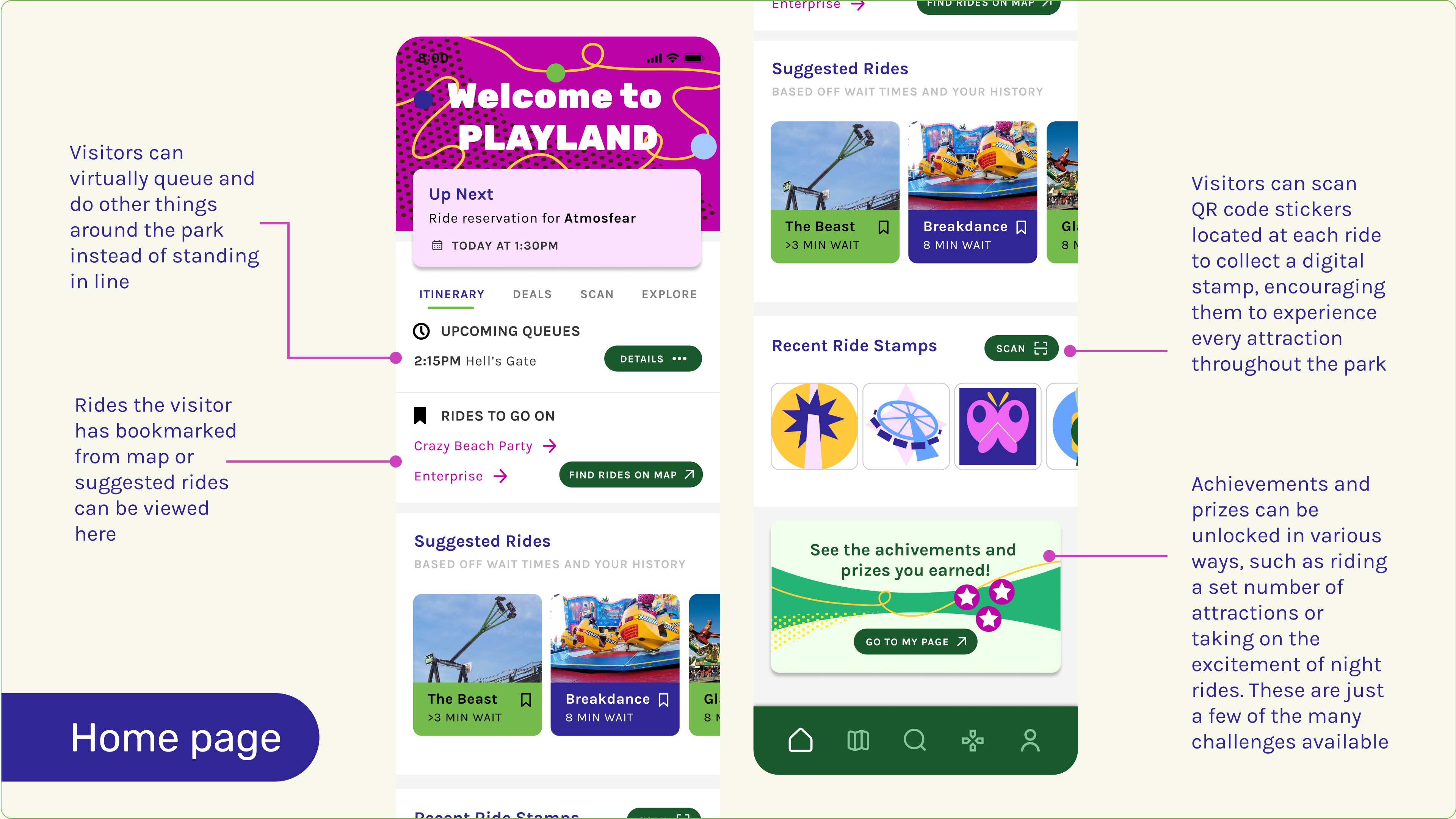
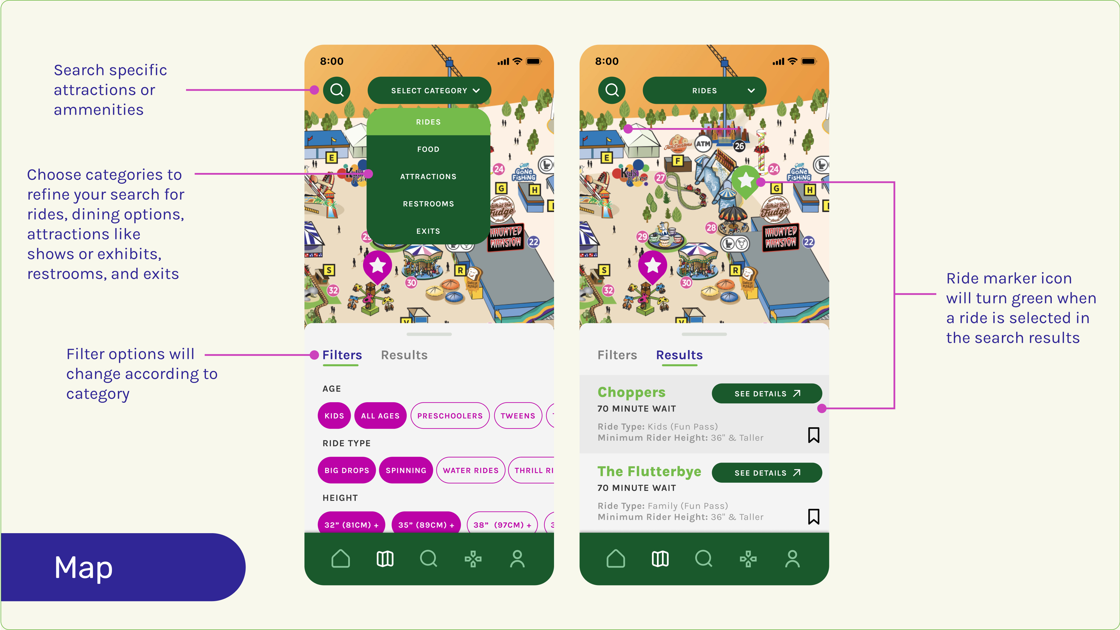
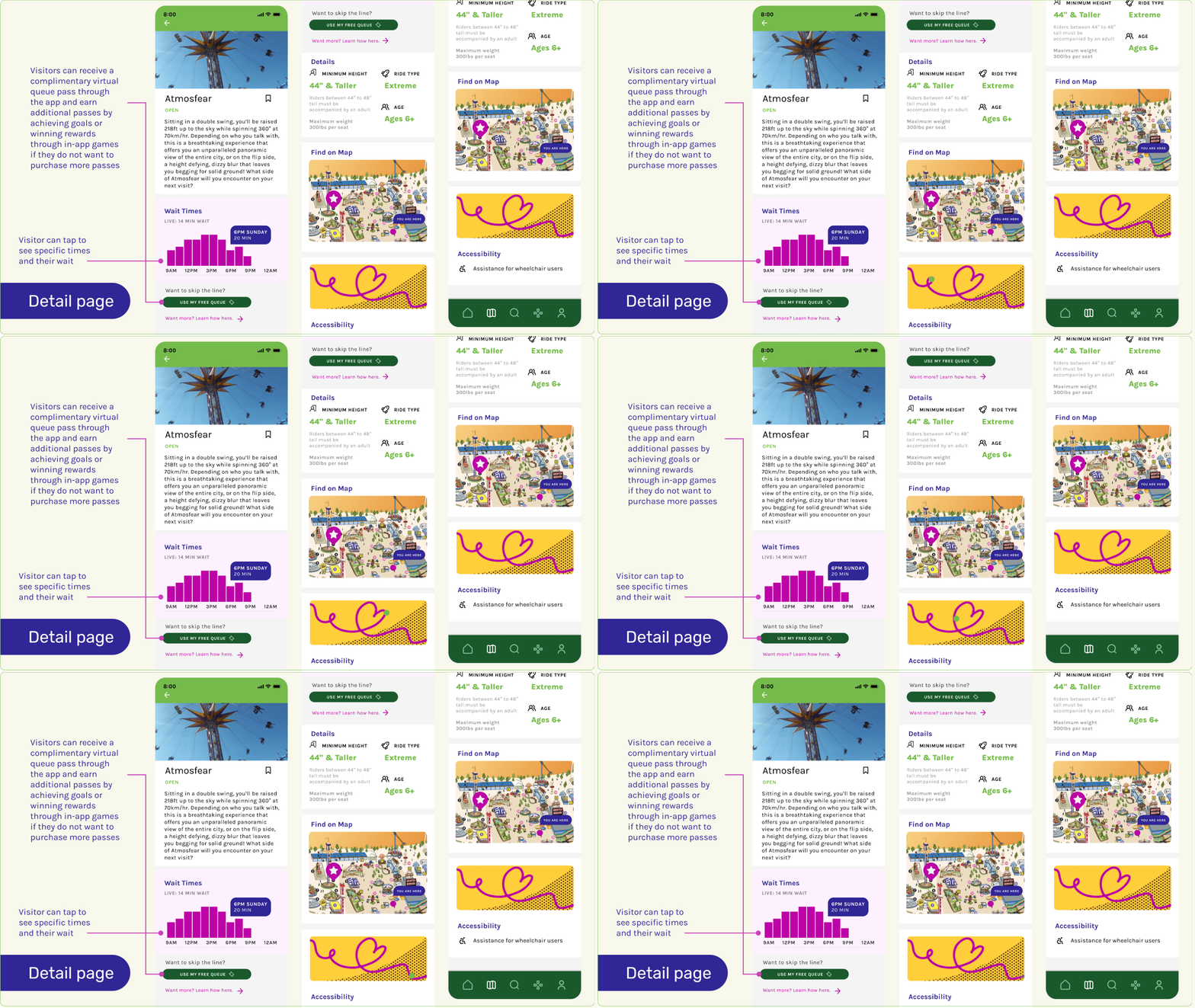
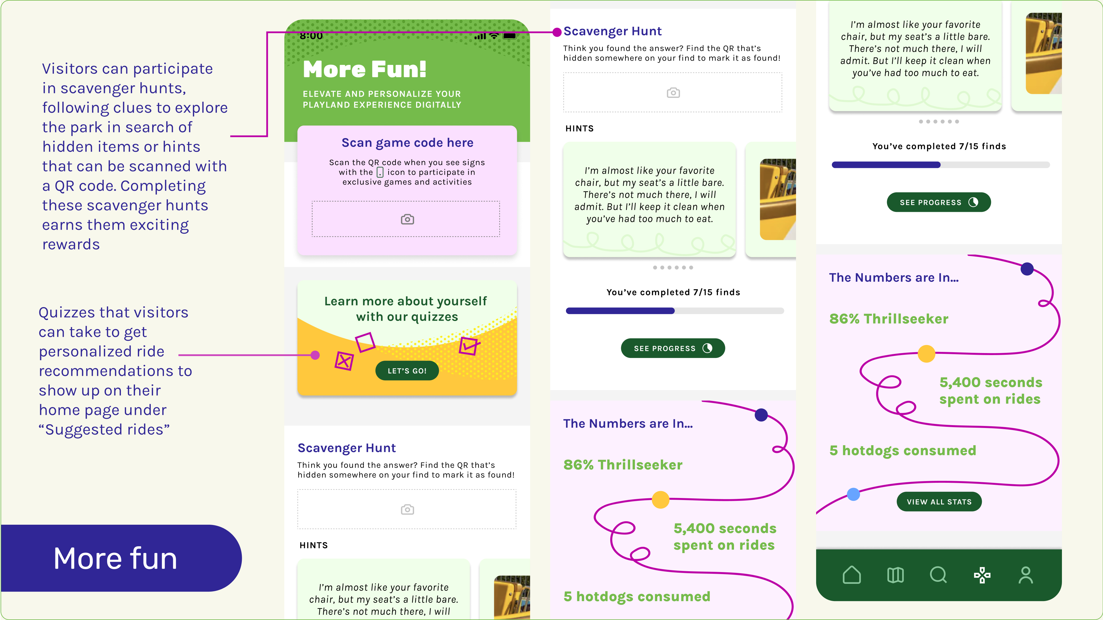
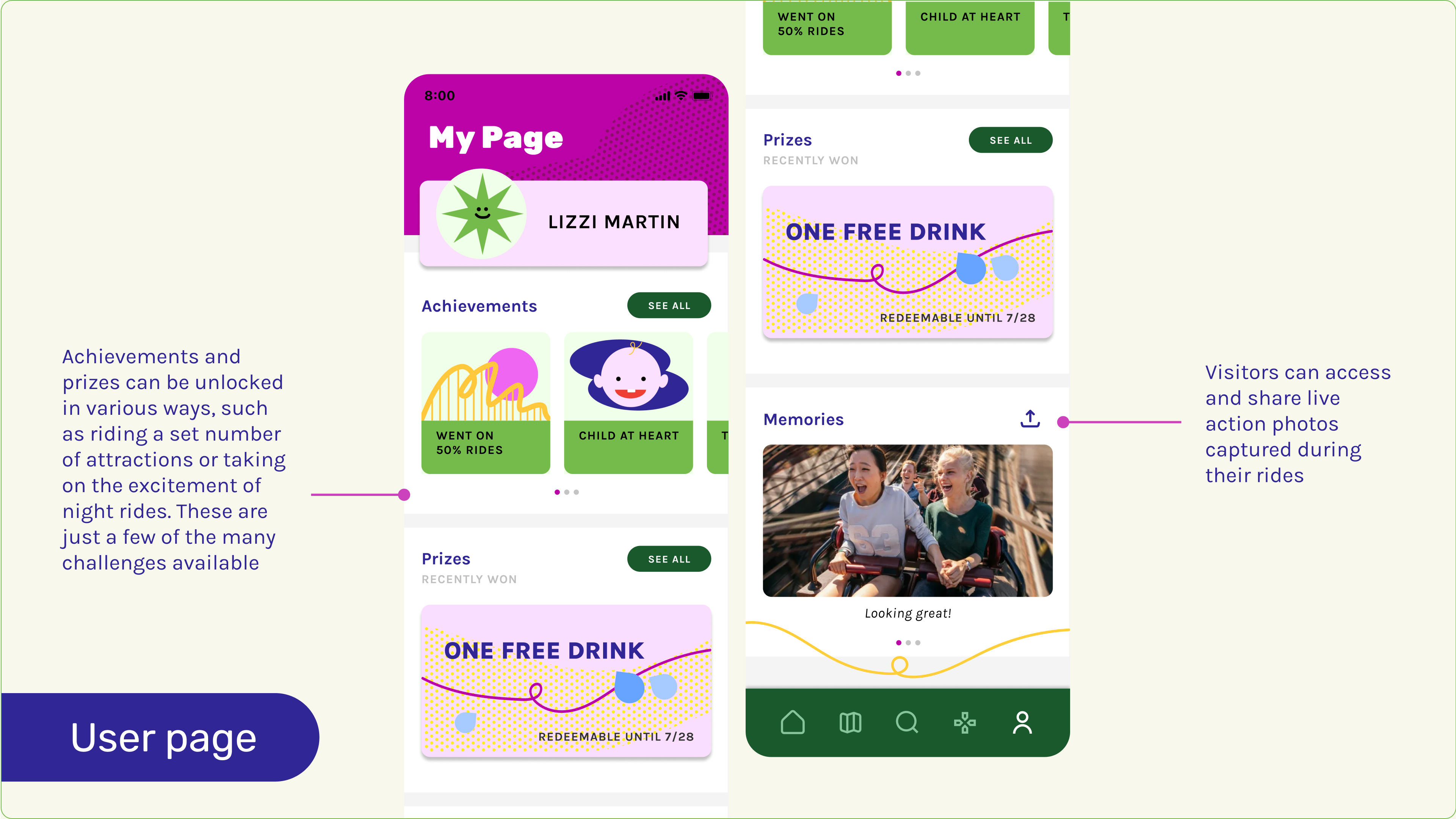
I created a mobile app that makes amusement park experiences more seamless and immersive, offering real-time ride information, effortless queuing, and interactive scavenger hunts to maximize enjoyment and minimize wait times.
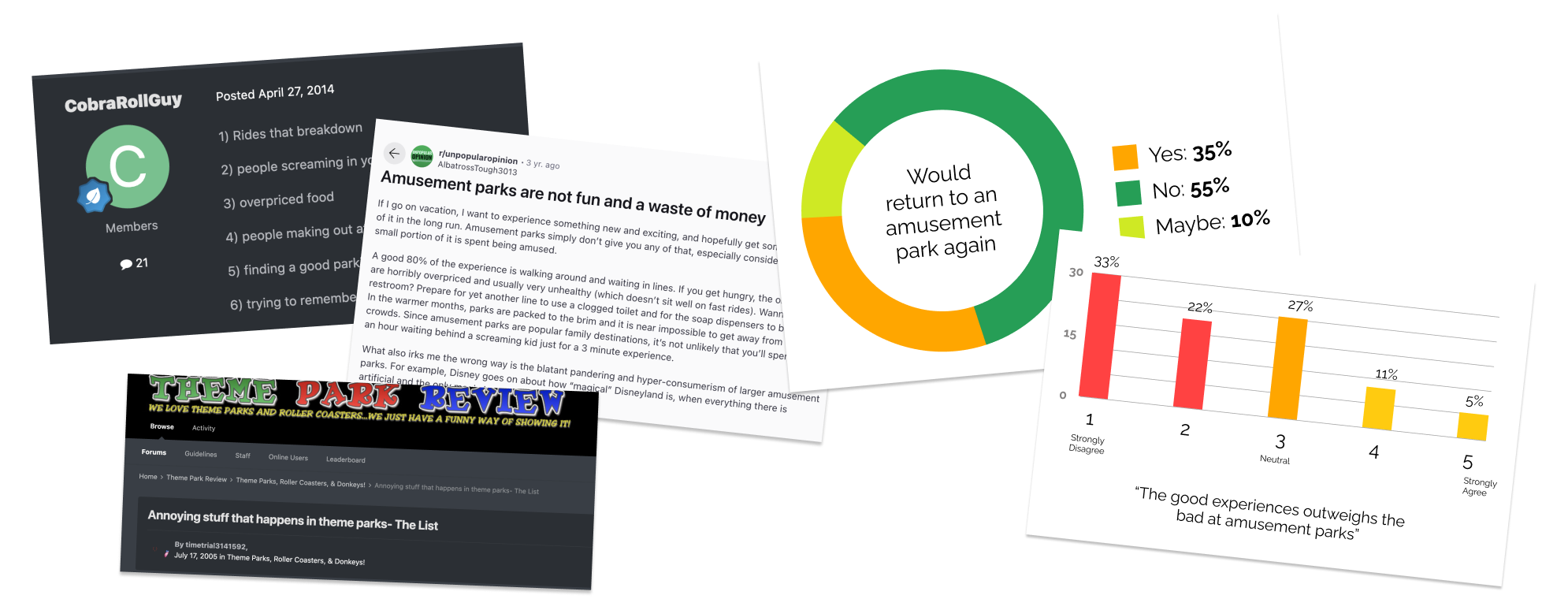
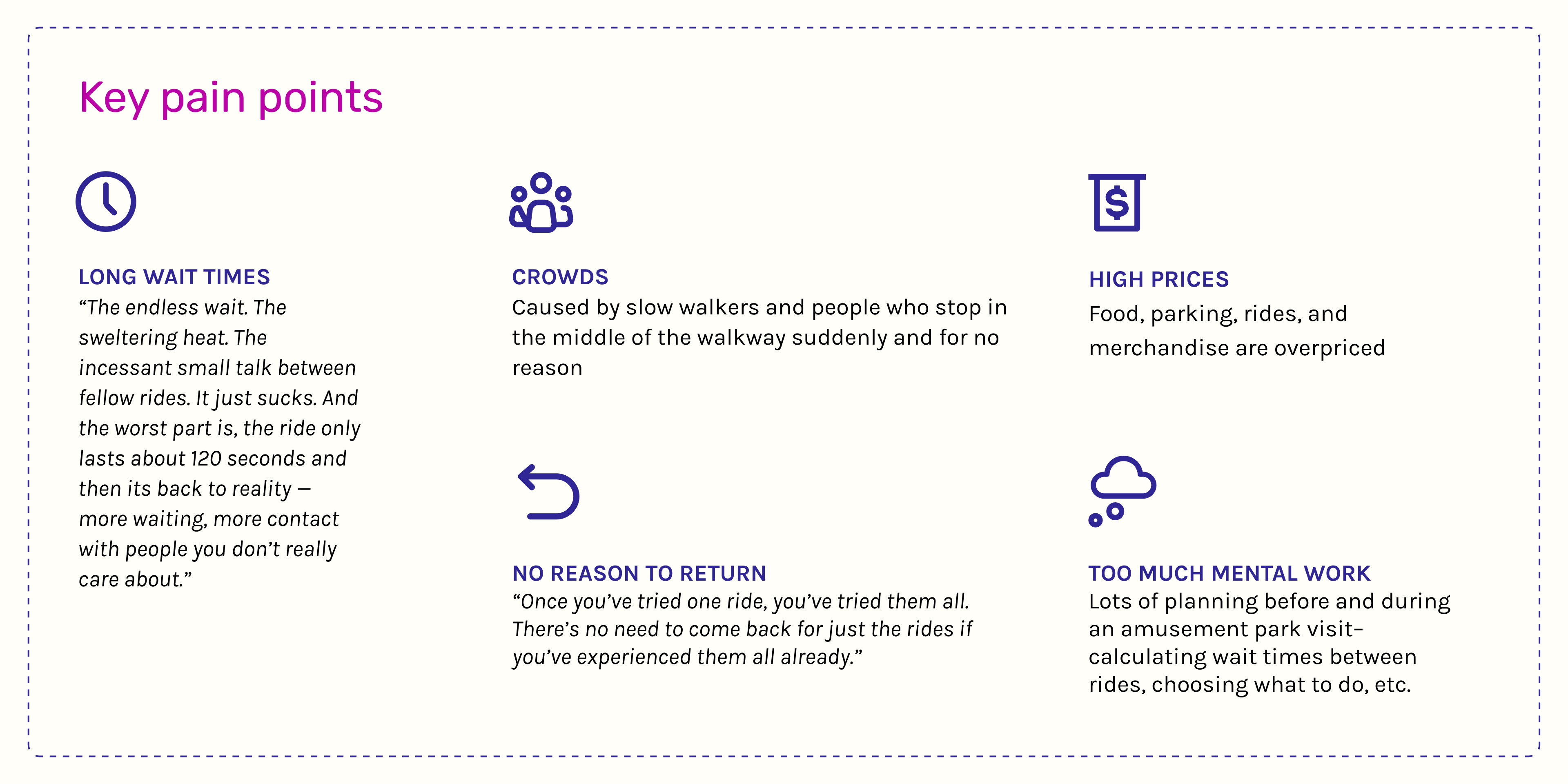
Amusement parks, once a popular destination, face growing challenges that turn the experience into a hassle. Planning a day at the park involves extensive effort, from navigating wait times to deciding which rides to prioritize. The fun is often overshadowed by frustration. Factors like these make amusement parks less appealing, leading to declining interest.

I conducted an in-depth analysis of why individuals choose not to visit amusement parks or opt not to return after their initial visit. To gain insights, I gathered data from online forums and conducted a survey, exploring key pain points and motivations that impact their decisions.
Through further research, I discovered that Playland's parent company, PNE, offers an app primarily for their events. Although it's not marketed as a Playland-specific app, it contains a few basic features that function as a stripped-down version of a navigation guide for the park, offering a minimal and bare-bones user experience.
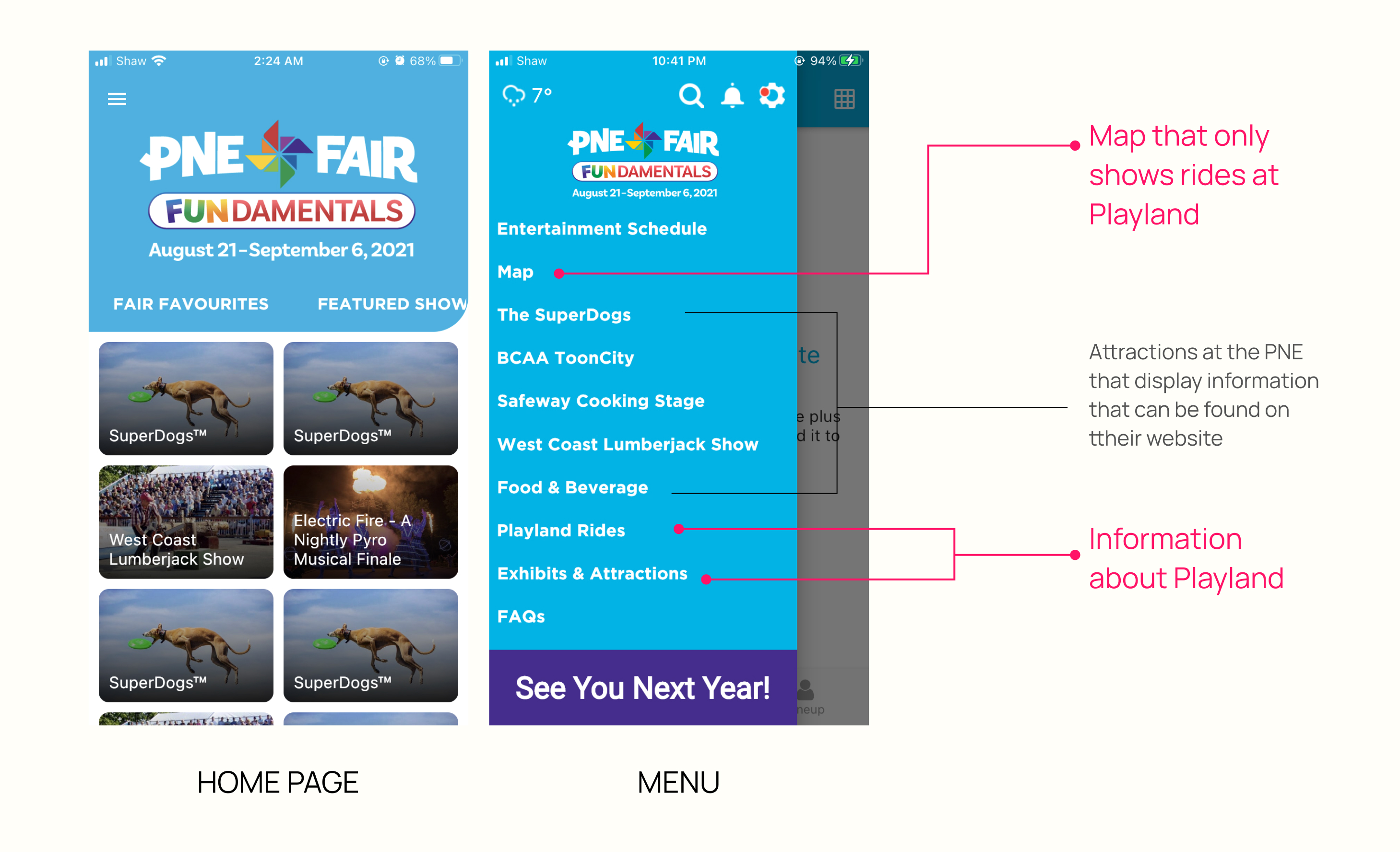
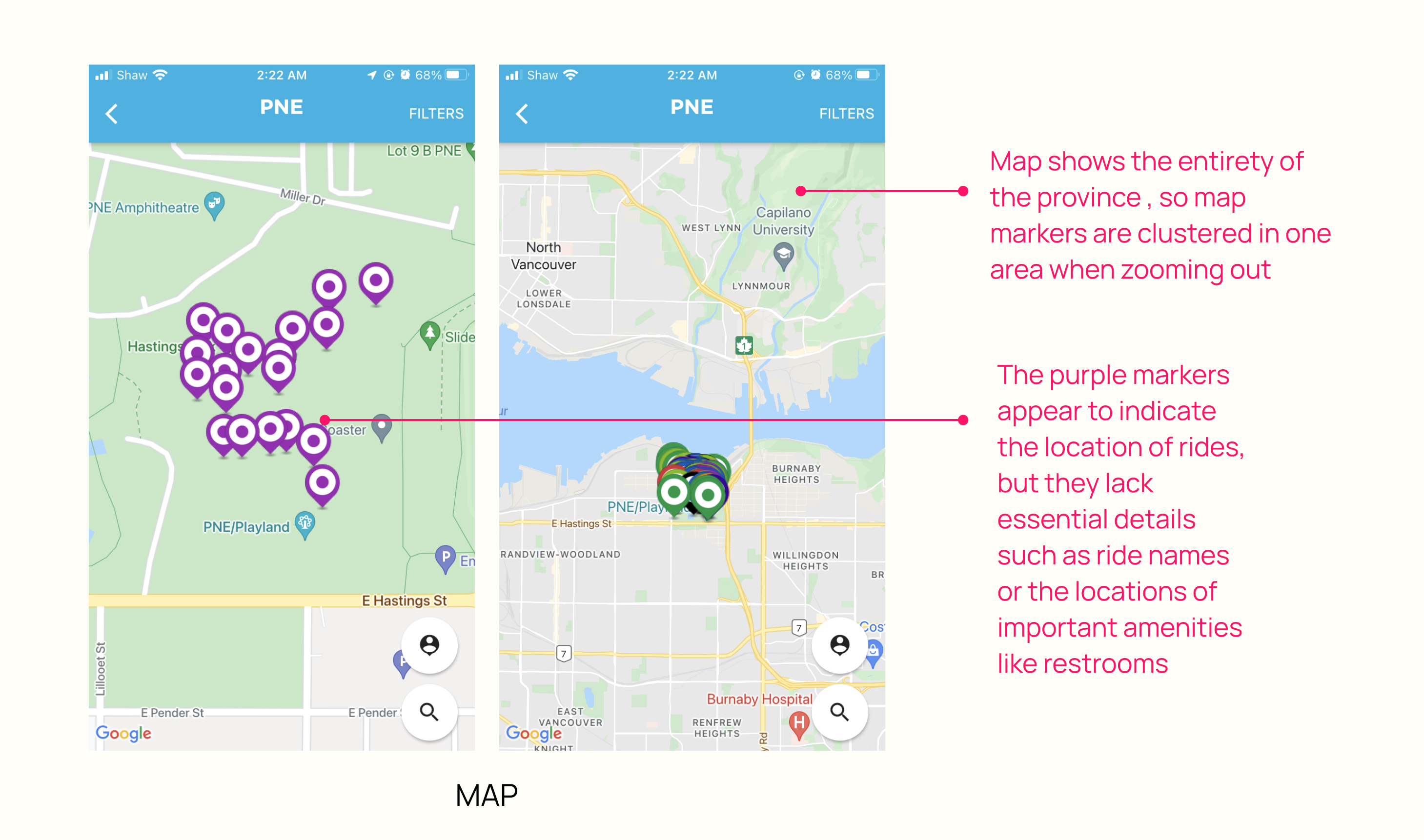
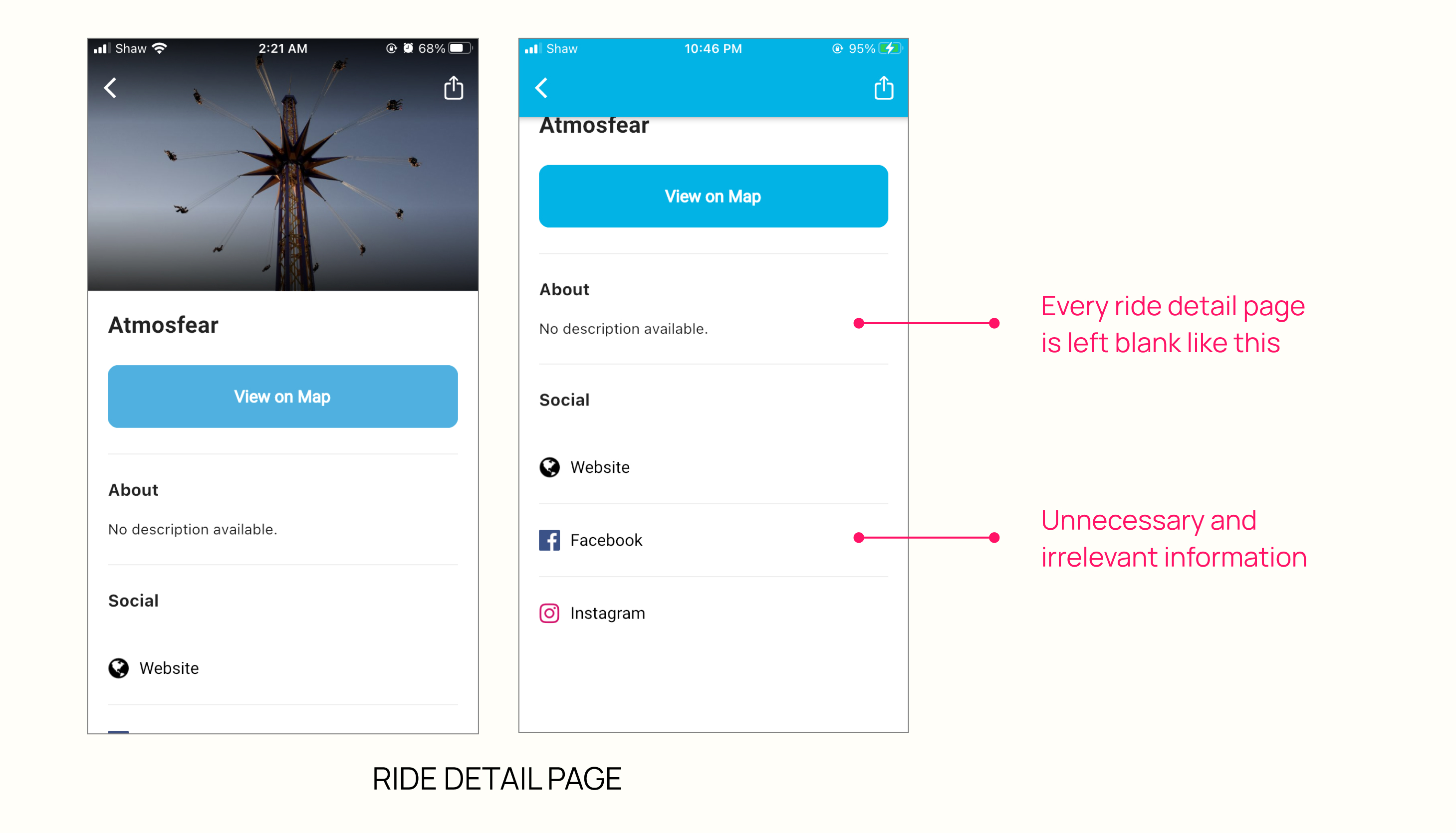
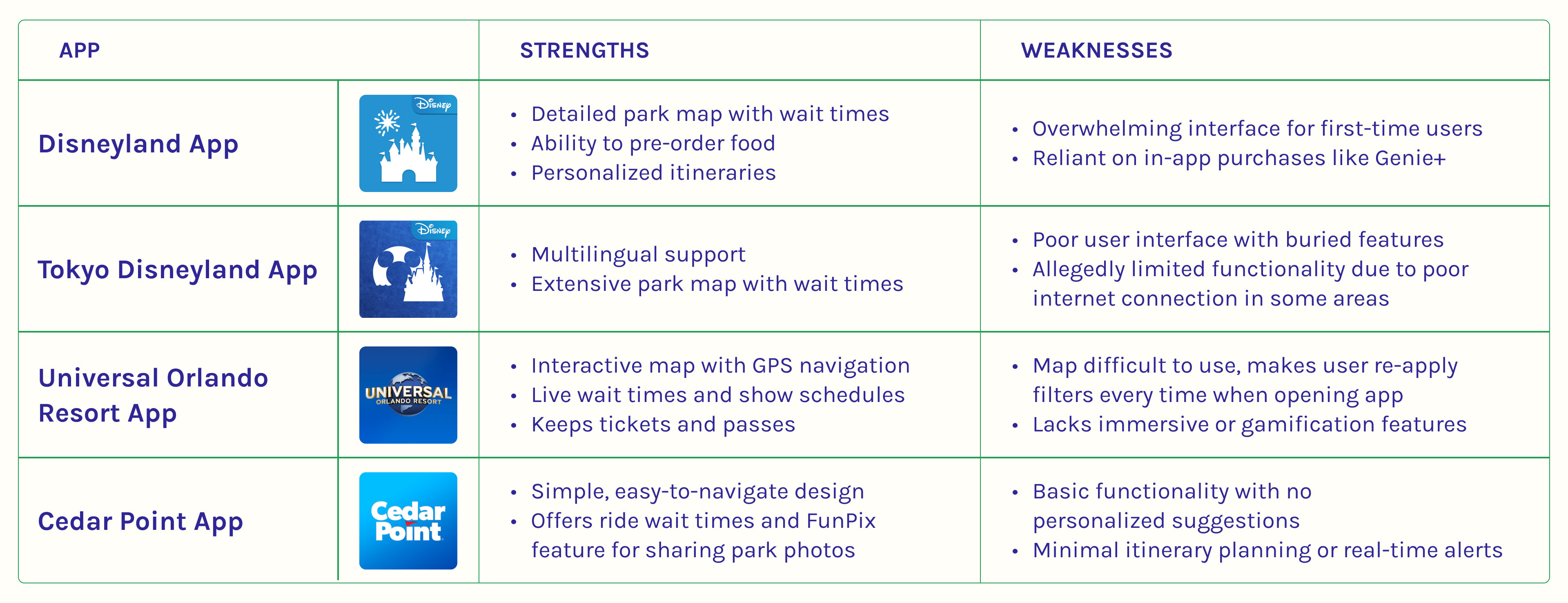
To better understand the current landscape of digital tools enhancing amusement park experiences, I conducted a competitive analysis of current popular theme park apps. I identified key features, strengths, and areas for improvement in existing apps, gain insights into gaps and opportunities for creating a more engaging user experience.
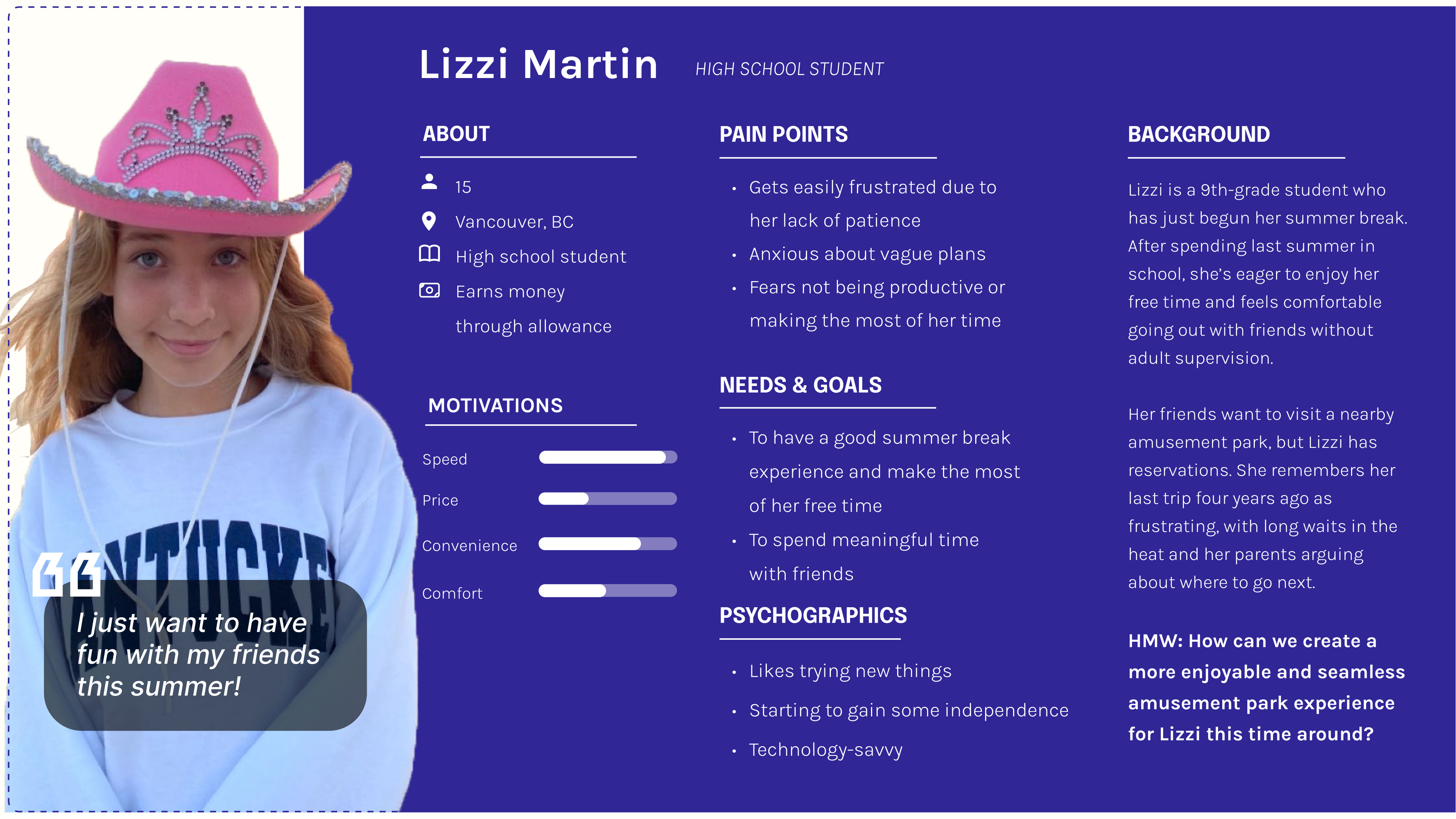
I created a user persona to inform my design decisions to provided a deeper understanding of the user and their motivations and needs.
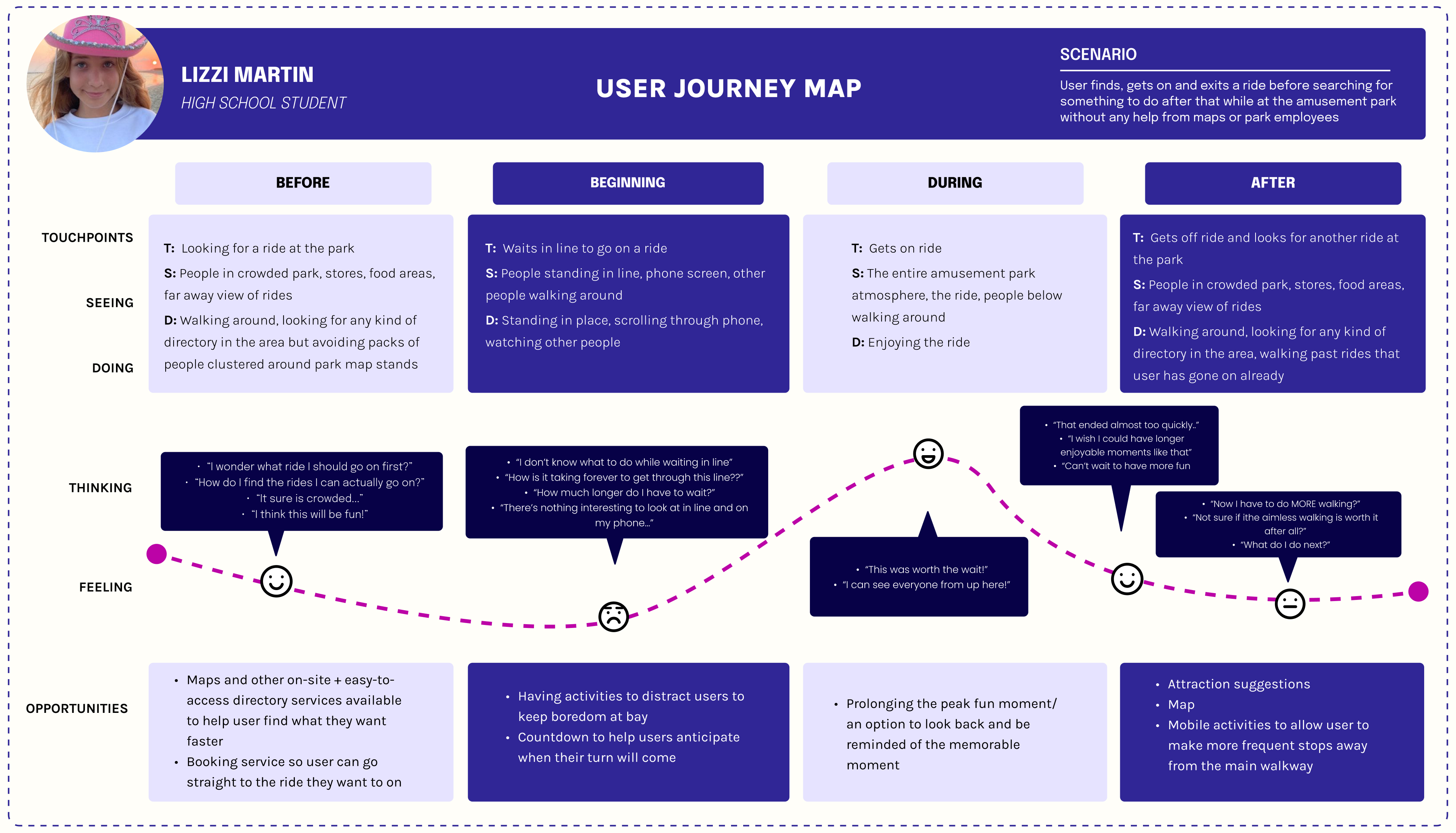
I created a user journey map to show the experience of a user as they navigate an amusement park—from discovering to exiting a ride. This map helps visualize the user's actions, emotions, and challenges throughout this journey. By analyzing this scenario, I can identify opportunities to enhance the user's experience.

KEY TAKEAWAYS AND OPPORTUNITIES

I ideated potential features that could captivate the target audience which consisted of primarily youth but also ensuring an engaging and immersive experience that would also still appeal to all visitors of all ages.
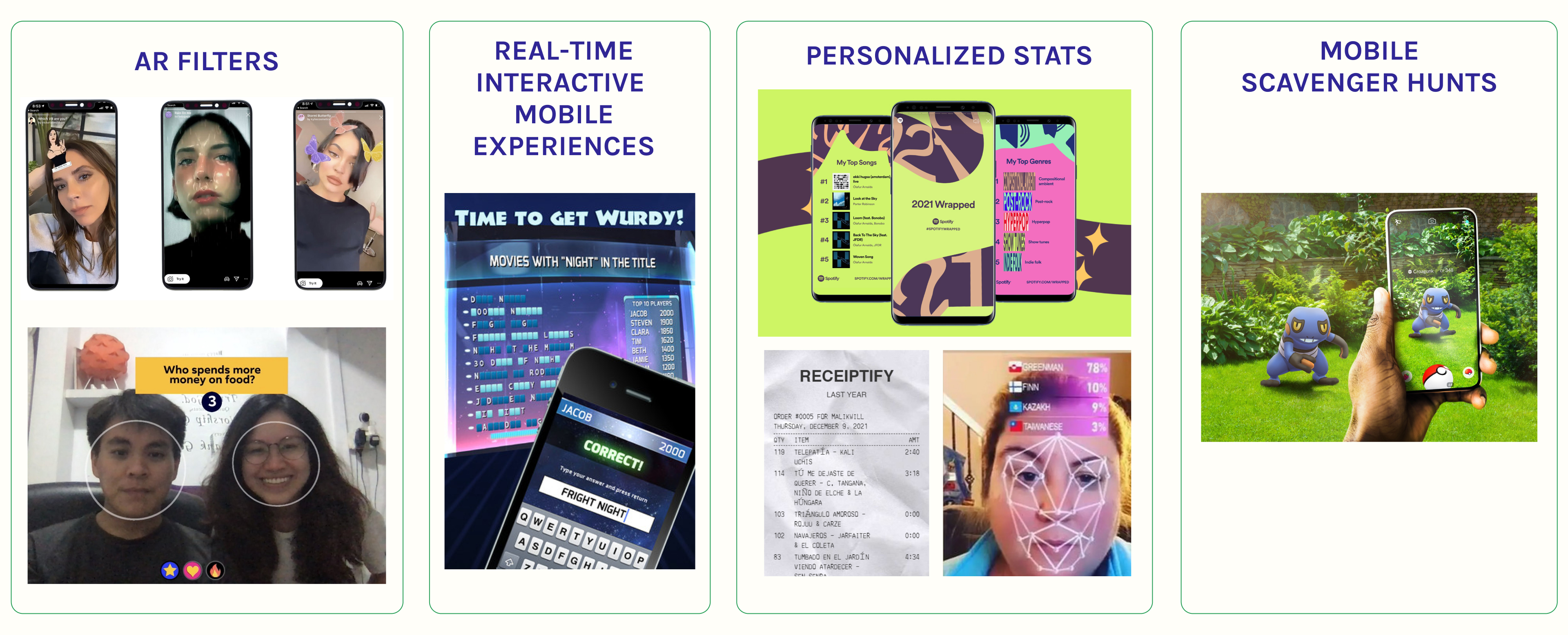
I drew inspiration from successful apps like Pokémon Go and the iconic, though now discontinued, Trivia app TimePlay by Cineplex (a nostalgic favorite for Canadian fans). I also looked to apps like Spotify and Receiptify, which showcase users' most-listened-to songs, and noted the widespread popularity of TikTok's AR filter trends.
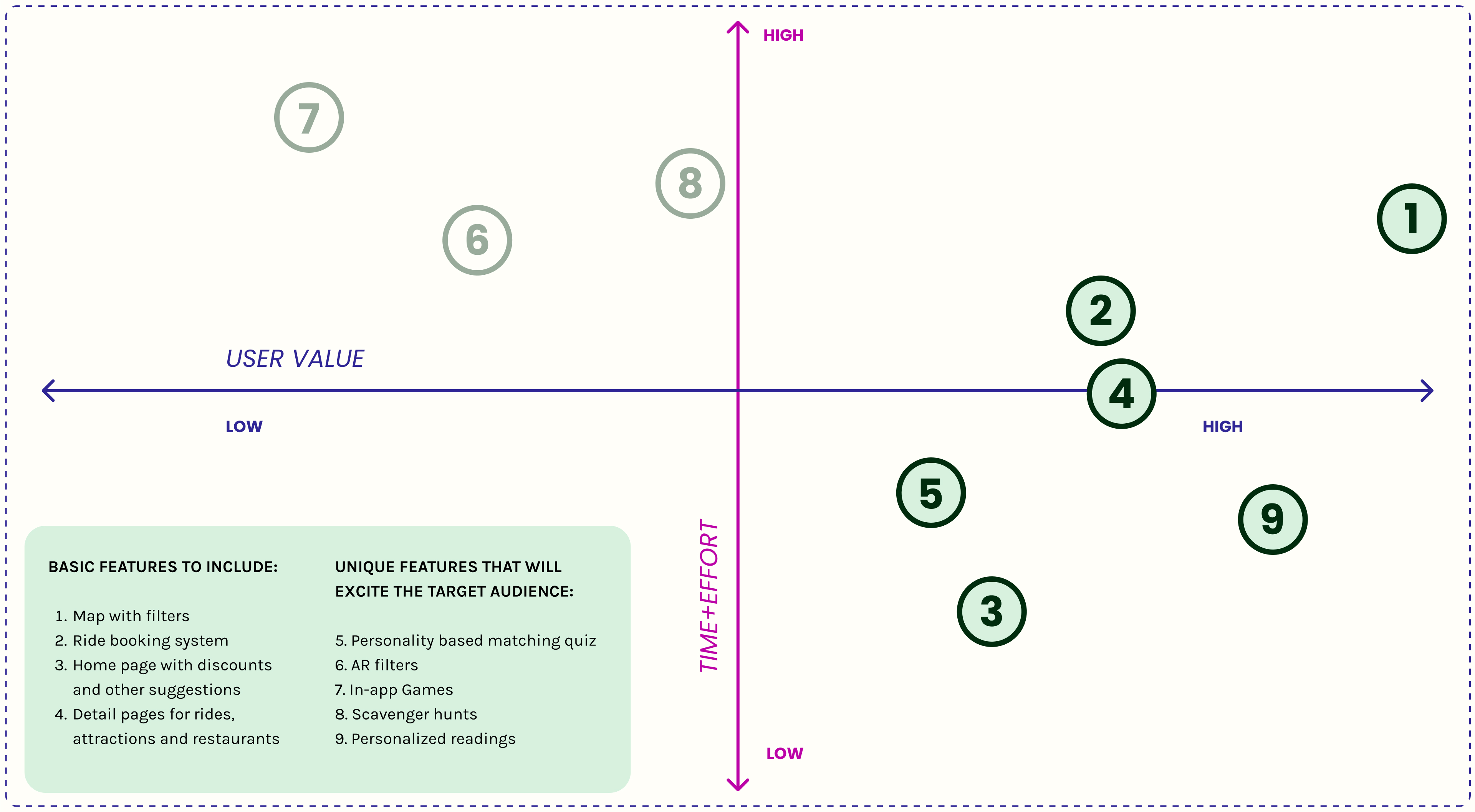
I developed a priority map that balances user value with the time and effort needed to design the features within my project timeline. This approach ensures that I focus on designing the most impactful features efficiently.
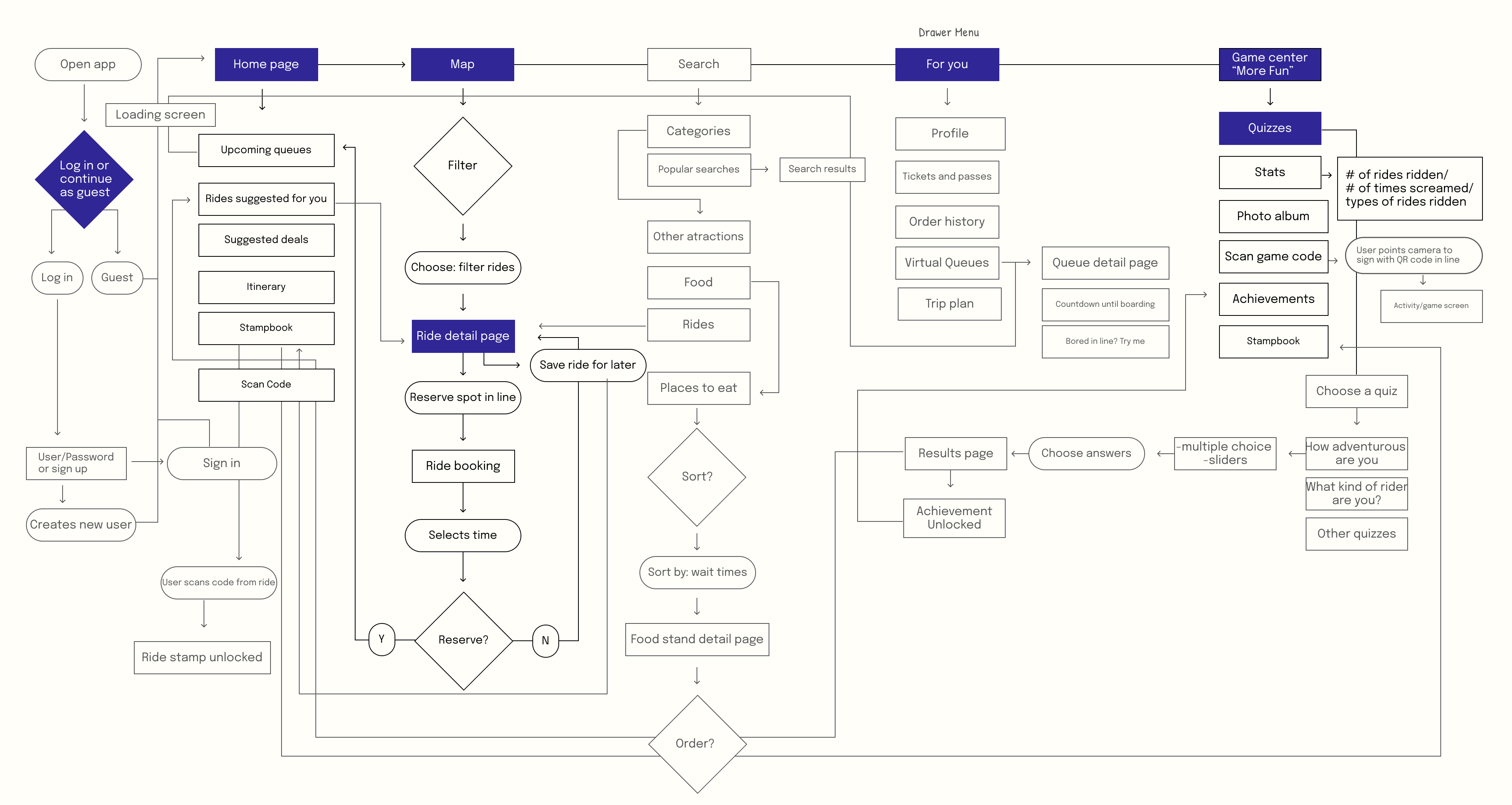
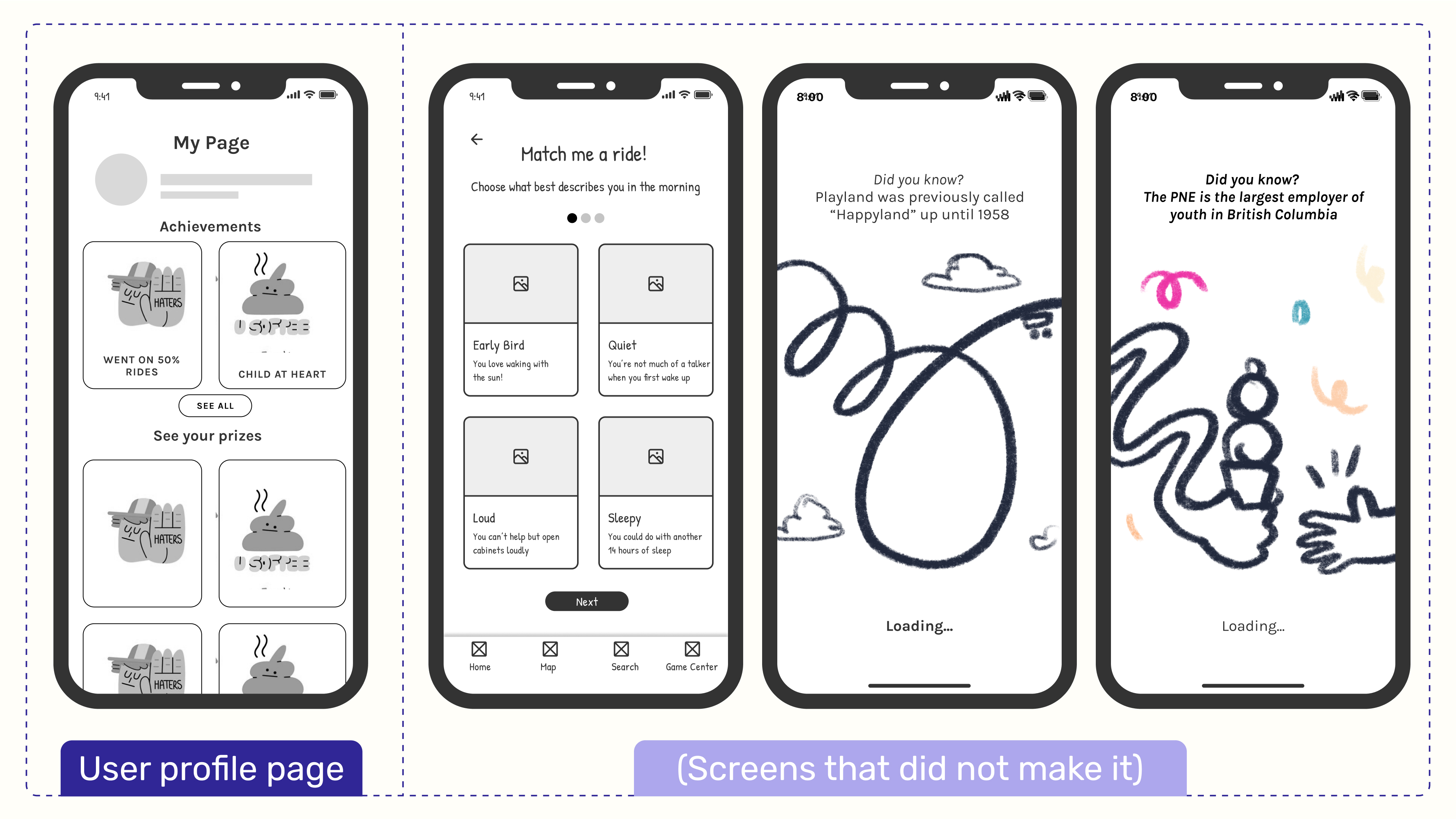
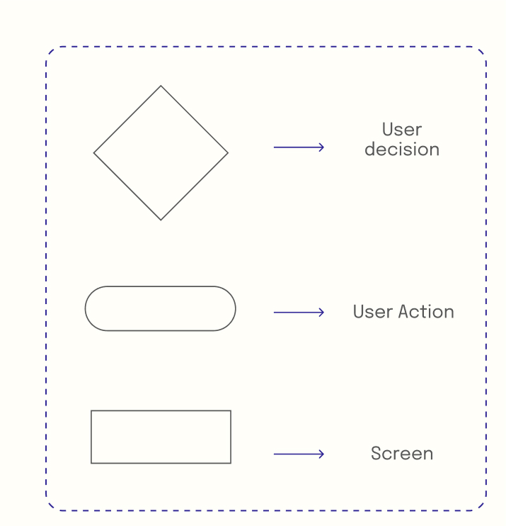
Given the project timeline, I prioritized certain key screens, highlighted in purple, to focus on delivering the most impactful features while maintaining a seamless user experience.

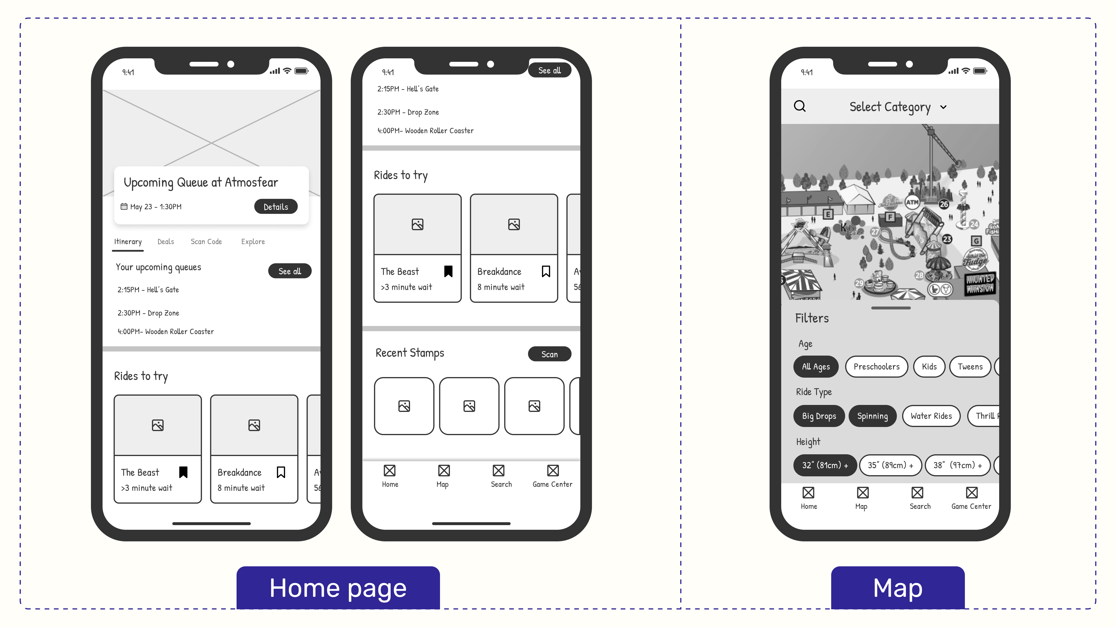
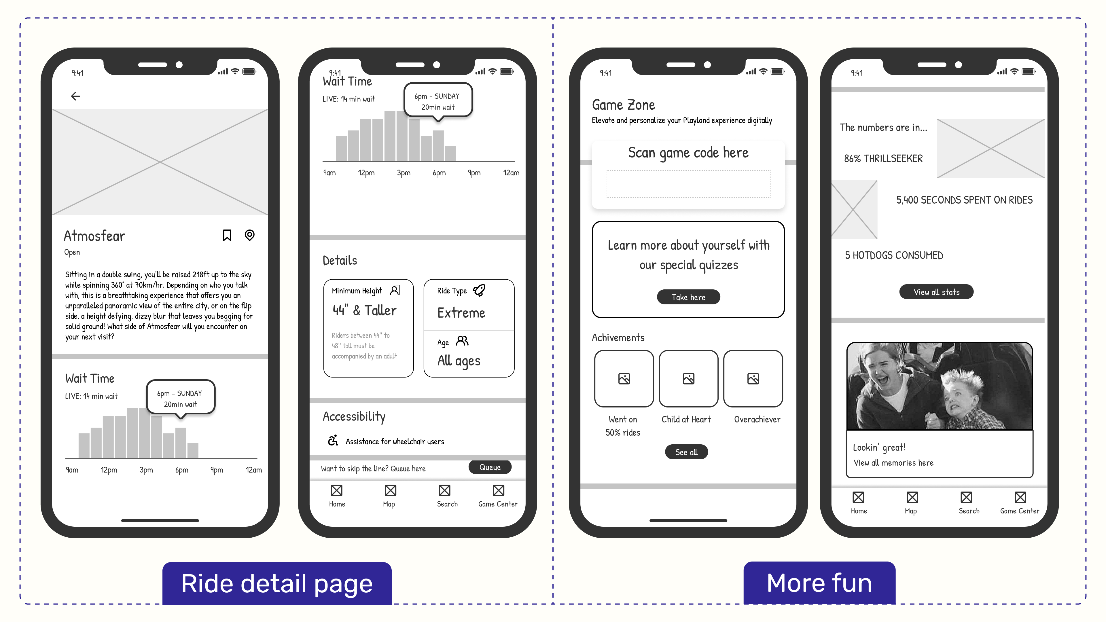
For this project, I bypassed low-fidelity sketches and moved directly into mid-fidelity wireframes to streamline the design process given the 4-week timeline. This allowed me to focus on key functionality and user interactions early on. From there, I quickly progressed to high-fidelity wireframes, honing in on the visual design and user interface details.
